Plotting Use Case: Spread–Skill Relationship
This use case demonstrates how to use VCasT’s plotting module to visualize the spread–skill relationship using pre-aggregated ensemble statistics computed from MET .stat files.
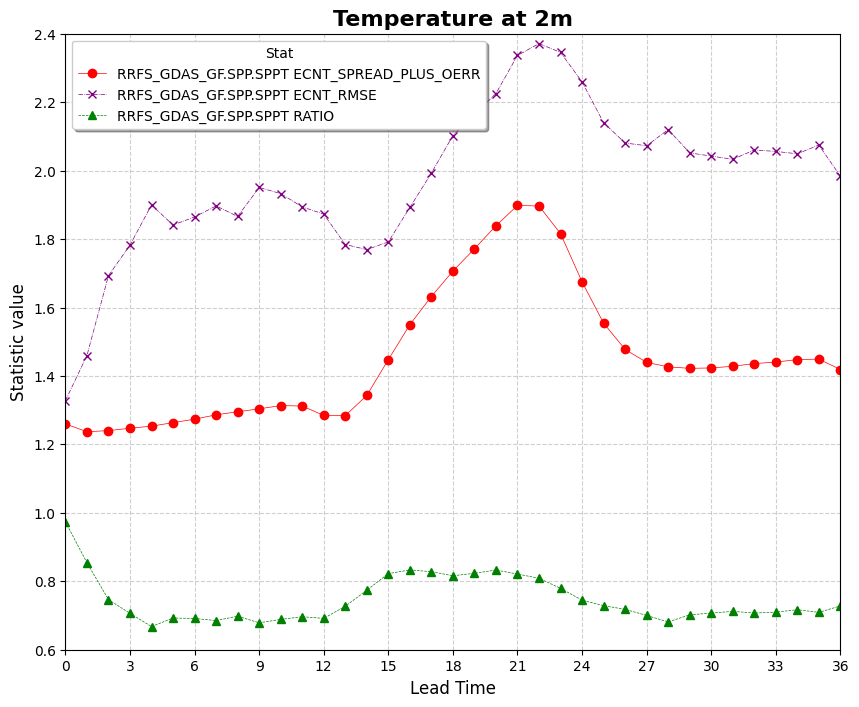
It uses a sample configuration file (plot.yaml) to generate a line plot showing the evolution of metrics such as spread, RMSE, and their ratio across lead times.
Prerequisites
Before running the example, you need an input file agg.data created in the previous use case MET Stat Use Case: Spread–Skill Relationship.
Run the Example
Clone the test repository:
git clone https://github.com/NOAA-GSL/VCasT-tests
cd VCasT-tests/examples/MET/spread-skill
Run VCasT with the plotting YAML file:
vcast plot.yamlThis will generate a plot illustrating the spread–skill relationship across lead times.
YAML Configuration Explained
Below is the content of plot.yaml, which configures VCasT to:
Load a pre-aggregated CSV file with ensemble verification statistics
Plot fcst_lead on the x-axis and spread/skill metrics on the y-axis
Focus on metrics like spread, rmse, and optionally the ratio (spread-plus-oerr / rmse)
 1start_date: "2024-04-29_12:00:00"
 2end_date: "2024-05-31_12:00:00"
 3interval_hours: "1"
 4
 5average: false
 6scale: 1
 7
 8plot_type: line
 9
10fcst_var: TMP
11
12vars:
13  - spread_plus_oerr: "./agg.data"
14  - rmse: "./agg.data"
15  - ratio: "./agg.data"
16
17unique:
18
19plot_title: "Temperature at 2m"
20legend_title: "Stat"
21labels:
22  - "RRFS_GDAS_GF.SPP.SPPT ECNT_SPREAD_PLUS_OERR"
23  - "RRFS_GDAS_GF.SPP.SPPT ECNT_RMSE"
24  - "RRFS_GDAS_GF.SPP.SPPT RATIO"
25
26line_color:
27  - "red"
28  - "purple"
29  - "green"
30
31line_marker:
32  - "o"
33  - "x"
34  - "^"
35
36line_type:
37  - "-"
38  - "-."
39  - "--"
40
41line_width:
42  - 0.5
43  - 0.5
44  - 0.5
45
46output_filename: spread_skill.png
47
48x_label: "Lead Time"
49y_label: "Statistic value"
50ylim: [0.6, 2.4]
51xlim: [0,36]
52grid: true
53yticks:
54xticks: [0, 3, 6, 9 ,12 ,15 ,18, 21, 24, 27, 30, 33, 36]
Output
The generated plot will be saved to the location specified by output_filename, such as spread_skill.png.