Plotting Use Case: Categorical Scores
This use case demonstrates how to use VCasT’s plotting module to visualize categorical verification metrics such as POD, FAR, CSI, FBIAS, and GSS for reflectivity forecasts.
It uses a sample configuration file (plot.yaml) to create a line plot from an aggregated dataset.
Prerequisites
Before running the example, you need an input file REFC_agg.data created in the previous use case MET Stat Use Case: Categorical Scores.
Run the Example
Clone the test repository:
git clone https://github.com/NOAA-GSL/VCasT-tests
cd VCasT-tests/examples/MET/cts_metrics
Run VCasT with the plotting YAML file:
vcast plot.yamlThis will generate plots for the specified categorical metrics.
YAML Configuration Explained
Below is the content of plot.yaml, which configures VCasT to:
Load a pre-aggregated CSV file with categorical scores
Plot fcst_lead on the x-axis and metric values on the y-axis
Include multiple metrics like pod, far, csi, fbias, and gss
1start_date: "2024-04-29_12:00:00"
2end_date: "2024-05-31_12:00:00"
3interval_hours: "1"
4
5average: true
6scale: 1
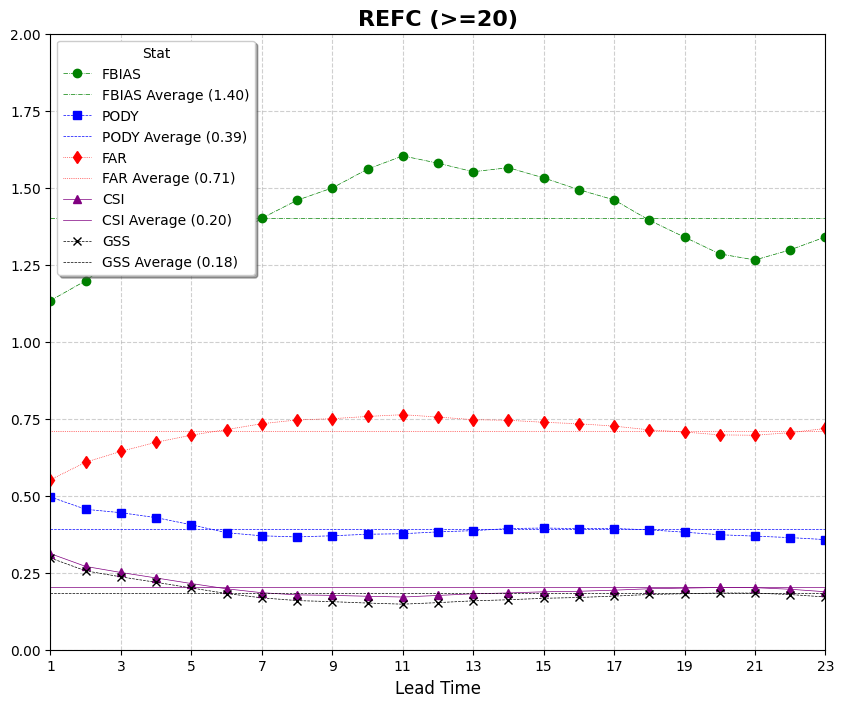
7
8plot_type: line
9
10fcst_var: REFC
11
12vars:
13 - fbias: "./REFC_agg.data"
14 - pody: "./REFC_agg.data"
15 - far: "./REFC_agg.data"
16 - csi: "./REFC_agg.data"
17 - gss: "./REFC_agg.data"
18
19unique:
20
21plot_title: "REFC (>=20)"
22legend_title: "Stat"
23labels:
24 - "FBIAS"
25 - "PODY"
26 - "FAR"
27 - "CSI"
28 - "GSS"
29
30line_color:
31 - "green"
32 - "blue"
33 - "red"
34 - "purple"
35 - "black"
36
37line_marker:
38 - "o"
39 - "s"
40 - "d"
41 - "^"
42 - "x"
43
44line_type:
45 - "-."
46 - "--"
47 - ":"
48 - "-"
49 - "--"
50
51line_width:
52 - 0.5
53 - 0.5
54 - 0.5
55 - 0.5
56 - 0.5
57
58output_filename: stat_agg_REFC.png
59
60x_label: "Lead Time"
61y_label: ""
62ylim: [0.0, 2.0]
63xlim: [0,22]
64grid: true
65yticks:
66xticks: [0,2,4,6,8,10,12,14,16,18,20,22]
Output
The generated plots will be saved to the location specified by output_filename, such as stat_agg_REFC.png.