Plotting Use Case: Reliability Diagram
This use case demonstrates how to use VCasT’s plotting module to generate a reliability diagram from pre-aggregated probabilistic forecast statistics computed using MET .stat files.
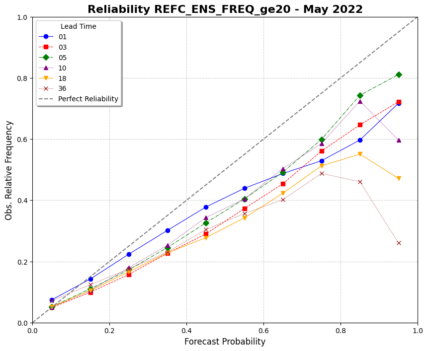
It uses a sample configuration file (plot.yaml) to create the diagram based on metrics like forecast probability and observed frequency.
Prerequisites
Before running the example, you need an input file agg.data created in the previous use case MET Stat Use Case: Reliability Diagram.
Run the Example
Clone the test repository:
git clone https://github.com/NOAA-GSL/VCasT-tests
cd VCasT-tests/examples/MET/reliability
Run VCasT with the plotting YAML file:
vcast plot.yamlThis will generate a reliability diagram using the aggregated probabilistic metrics.
YAML Configuration Explained
Below is the content of plot.yaml, which configures VCasT to:
Load a pre-aggregated CSV file with reliability metrics
Plot forecast probability vs. observed frequency
Optionally show the perfect reliability line and no-skill region
 1plot_type: reliability
 2
 3fcst_var: REFC_ENS_FREQ_ge20
 4
 5vars:
 6  - 10000: "./agg.data"
 7  - 30000: "./agg.data"
 8  - 50000: "./agg.data"
 9  - 100000: "./agg.data"
10  - 180000: "./agg.data"
11  - 360000: "./agg.data"
12
13unique:
14
15# General plot parameters
16plot_title: "Reliability REFC_ENS_FREQ_ge20 - May 2022"
17legend_title: "Lead Time"
18labels:
19  - "01"
20  - "03"
21  - "05"
22  - "10"
23  - "18"
24  - "36"
25
26line_color:
27  - "blue"
28  - "red"
29  - "green"
30  - "purple"
31  - "orange"
32  - "brown"
33
34line_marker:
35  - "o"
36  - "s"
37  - "D"
38  - "^"
39  - "v"
40  - "x"
41
42line_type:
43  - "-"
44  - "--"
45  - "-."
46  - ":"
47  - "-"
48  - ":"
49
50line_width:
51  - 0.8
52  - 0.8
53  - 0.8
54  - 0.8
55  - 0.8
56  - 0.8
57
58
59output_filename: stat_agg_reliability.png
60
61grid: true
Output
The generated reliability diagram will be saved to the location specified by output_filename, such as stat_agg_reliability.png.